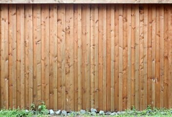
Creativity didn’t stop in quarantine. In fact, it flourished.
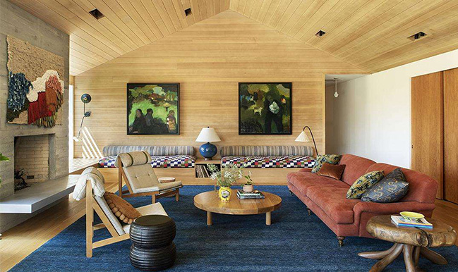
Laure Joliet, Domino
By Angelina Hazzouri
When it comes to interior design, trends come and go, but creativity is constant. Throughout the last few months, we all had time to reflect on what is important to us in life… and we’ve also had time to reflect on the interiors of our home spaces surrounding us. After all, we were inside for three months. If your home didn’t change at all, we’re impressed; but maybe it’s time to freshen up that room you’ve been meaning to change. We’ve compiled a list of design trends to look out for in the coming months, and these are definitely worth considering.
Color
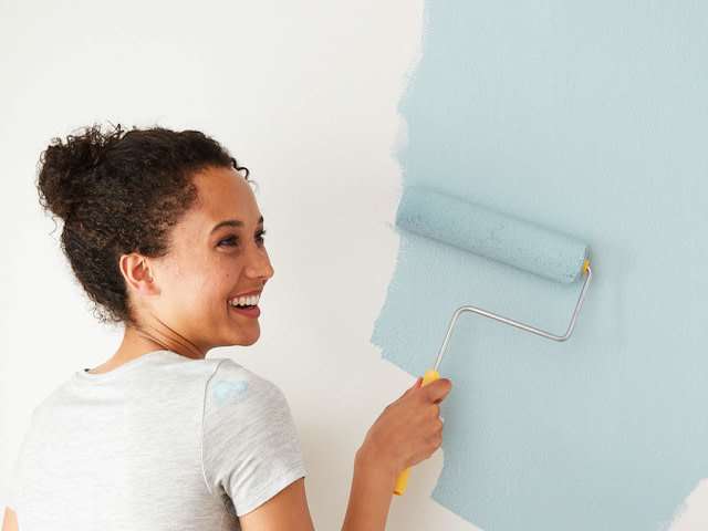
CLARE
If you’ve been feeling blue at all in the last few months, you’re not the only one. The solution? More blues! In terms of color trends for the coming months, we are seeing many muted tones and clean blues – – colors that lift our spirits and keep us calm — ZAR Blue Moon
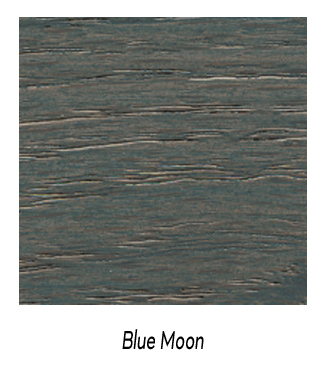
For 2021, Pantone has released its Synergy palette, which includes peaceful and pleasing colors that will carry us through next year.
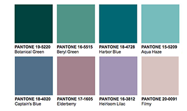
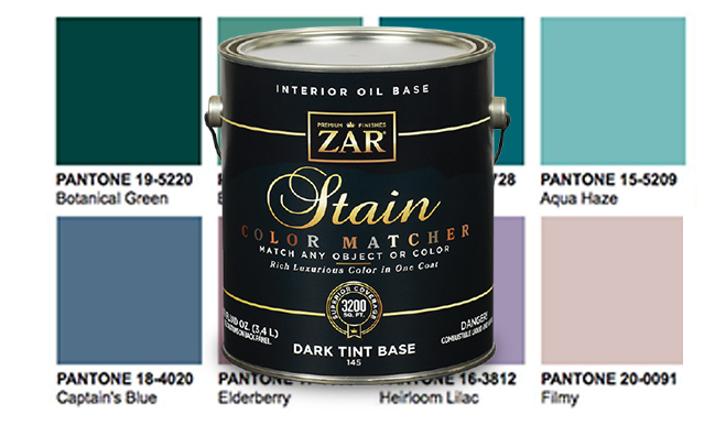
In addition to two cool blues in the Synergy palette (Aqua Haze and Captain’s Blue), Pantone has included rosy-purple tones that will make any room a place to relax. On the other end of the spectrum, Botanical Green and Harbor Blue add a pop of color to your life, and they provide the perfect backdrop to our new world of hope and unity. UGL released a Light Color Matcher, a tint base that can accept any popular paint color to achieve translucent, bright tones to trim, furniture, moldings, etc.
Wood Stain
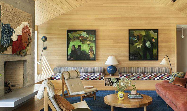
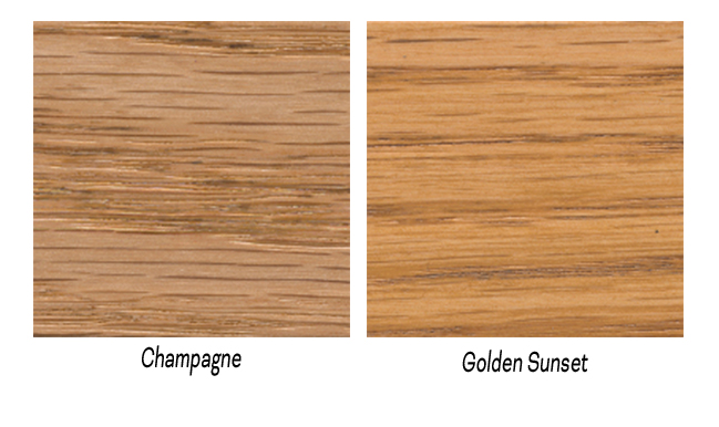
Along with lighter paint colors, you might have guessed that dark floors are on their way out. With a concern for nature and an emphasis on positivity, we will be turning more toward light woods for multipurpose spaces. Rift Sawn lumber in white oak with a ZAR Interior Polyurethane seems to be the perfect fit for a lighter palette. Or wood tones like ZAR Champagne from the Trending Collection or ZAR Golden Sunset from the Global Canvas Collection.
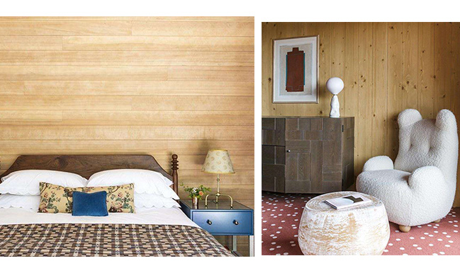
Not only does this apply to flooring, but this is also something that will gain prevalence in covering walls and ceilings (TrendBook). Light wood-paneled walls are the new shiplap, as seen in Domino’s Trend Section. “By keeping the lines of the furniture clean and modern, the space feels anything but dated,” says Frances Merrill of Reath Design (Domino). Examples of this airy, classic look are seen below.
Lighting
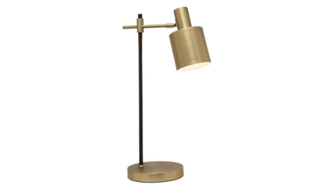
Remington Lighting Style Number 13595
Brass is back – – with a twist. “Today we see a lot of brass, but it’s not shiny and yellow like the brass in the 80s. It’s a sexier, deeper, richer brass,” says Nina Magnani, interior designer and Director of Design for Remington Lighting. “And the brass is in the soft matte finish now. It’s easier on the eyes.” This is consistent with the trends for color and wood stain that we see: soft, easy elements that fill any room with positive energy.
Additionally, we’re seeing a lot of brass paired with other finishes. For example, Remington https://remingtonlighting.com/ has been pairing brass with matte black to create a symbiosis between two unlikely finishes, as shown above.
As summer is fully in swing, it’s the perfect time to spruce up a room or two in your house, whether it be with an airy paint color, light wood, or a touch of brass. The possibilities are endless in design, and these trends will make any house feel like a home.

